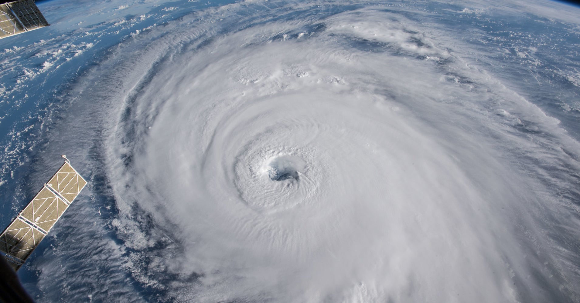
This Map Shows Which Communities Need The Most Help In A Disaster
So, in 2003, University of South Carolina geographer Susan Cutter developed a method for encapsulating all these factors in a single number, the Social Vulnerability Index. The social vulnerability map (right) shows which parts are most socially vulnerable (dark blue) and least socially vulnerable (light green). In Lumberton, North Carolina, for example, the most socially vulnerable communities also see the greatest risk of flooding. The same goes for communities of color, which are often situated in vulnerable areas as a result of discriminatory housing practices. The flooding of southwest Lumberton, for example, highlights the need to guard vulnerable communities against future natural disasters.
Source: Huffington Post September 27, 2018 18:33 UTC


