


Africa on the world map: What's the real size?
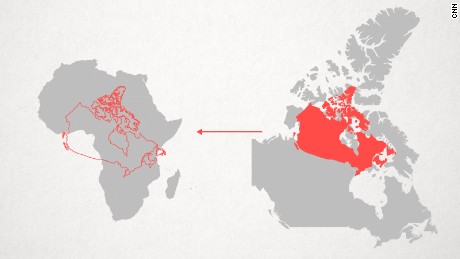
Our world map is wildly misleading. A map made by Europe for EuropeOn the Mercator map, Africa -- sitting on the equator, reasonably undistorted -- is left looking much smaller than it really is. "If you would take a map projection with equal areas then there is almost no space on the map to display all [these details]." One of the dangers of the Mercator map is that it can make enlarged countries seem unnaturally powerful and intimidating. Was subsequent European imperialism perhaps spurred on by a map projection that reinforced the notions of self-importance held by those nations?
Source: CNN August 19, 2016 00:54 UTC


